I’m no expert on the COVID epidemic, but I did excel in high school science which apparently means I’m OK to opine on Facebook about it if I can believe what so many of my friends post. Actually, I don’t think anyone has achieved expert status on the overall epidemic, even though I think there are MDs who’ve gotten pretty expert at treating it.
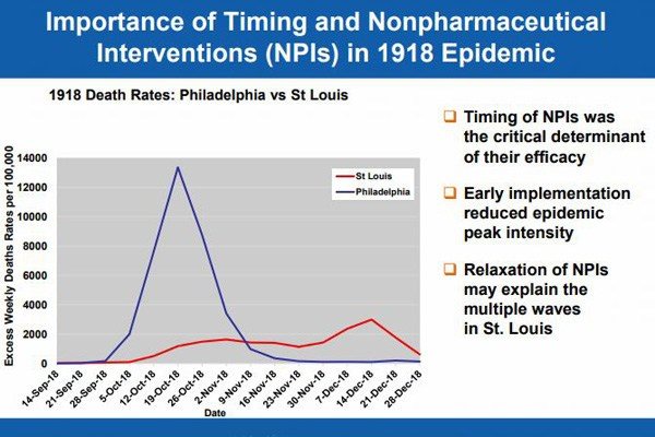
Anyway let’s go back to the beginning per Vizzini and take a look at the chart that at least in March explained it all, said chart which I have included a copy of for your viewing pleasure. Take a look at it.
Anything strike you about it?
If you replaced Phily with New York and St. Louis with the rest of the country and adjusted the dates by over a hundred (!) years, it sure looks to this simple mind a lot, I mean a lot, like what we are going through. Basically the virus ran rampant in Philly then and NYC now, while St. Louis then and the rest of the country now managed to keep it under much better control.