Let’s talk numbers. I know what you’re thinking, I was promised no math. So no equations, just a couple of pretty pictures and a lot of words. I trust we’ve all seen the first chart – we know it, we love, we live it.
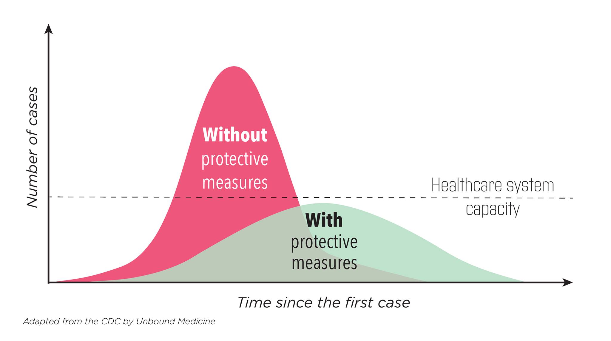
Let’s be honest, it isn’t accurate, it’s idealized.
The first thing I’ll note, is if the only thing that changes is that as time goes on more people become immune, the right side is not symmetrical with the left side, in fact the drop off is faster than the rise and that is because during the rise the rate of change in available infectees is less than during the descent because there are fewer available infectees. And yes, I created an Excel model and discovered this.
The second thing, is that for this epidemic at least, you don’t start with protective measures (you know, the guidelines) in place, so the reality is there is this transition period as people react, and in the case of COVID in advance of any orders to, so there would be this period of lowering the transmission as behavior changed that would put you on a different slope.
The third thing is, people are people. And that means we have this tendency to adjust to risks so as we see the curve flattening (and thus the risk lowering), we would engage in riskier behavior, and as we see the curve steepening, we would engage in less risky behavior. Don’t believe me? Look at the history of automobile safety, where every safety advance is met with an increase in risky behavior such that deaths per mile decline less than what the safety feature should cause.
So put that all together, and you have the actual reality of new cases just won’t ever look like those nice curves (oops, did I forget to mention random noise, so unsmooth the curves!) It will start steep, then flatten, but won’t ever go all the way down like you think it ought to. And there may well be multiple upticks depending on how long until either a vaccine or herd immunity kicks in.
I will just note at this point the area under the curves are not the same – the one that has lower transmission rates will have less area, i.e. fewer people will get infected. (Thanks again, Excel model). But since these are idealized, and the reality is messy and complicated, yeah, all bets are off on which one infects fewer people.
And that’s the real curve of actual new infections. Now let’s talk about the measured version. It isn’t the actual number, it’s a sample of the actual number.
So it’s going to have more noise (go to Worldometer, look at the new daily death histogram for the USA and explain to me why it varies 100% over a six day period – don’t worry, I’ll wait).
And it’s going to depend on how many tests we run a day. More tests mean more new cases measured. If the actual number were flat, if you ran more tests you would see an increase in the number of cases. As I always said about software bugs, the sooner we stop testing the sooner we’ll stop finding problems. Normally we take care of that by normalizing, i.e. dividing the number that allows you to make meaningful comparisons like total number of people in a state to compare states or total number of tests (which is why I think Dr. Birx, whom I admire and respect, was always quoting the percent positive rates on tests as well as the totals).
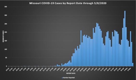
Now normalizing works well if you are consistent in your test criteria, e.g. people who have symptoms bad enough they are willing to have a swab shoved far, far up their noses (in the old days, till it came out the back). And test type. What happens when you starting with one test done by hand in state labs, and then keep adding different tests run on different equipment and you switch from shoving the swab 4 inches up someone’s nose to 2 inches? Do they all have the same sensitivity and error rates? But wait, that not the only changes you make, what happens when you keep increasing your testing to the point where you test everybody in a meat packing plant even though no one asked to have a swab shoved up their nose? IOW, you test both asymptomatic as well as symptomatic? You see another round of big jumps, like where Missouri found 373 workers were infected but asymptomatic. And at the same time you’re looking at new cases chart like the one I included, the State of Missouri is moving the date of the case from the test to when the person reports the first symptoms occurred.
So look at that chart and tell me are cases increasing, declining, or treading water. And while you’re at it, try to come up with a way to normalize across all those changes in testing. I don’t know about you, but when I try to look at that real chart and compare it to the idealized chart, I wonder how one can possibly relate to the other, and I’m vary comfortable with data, noise, uncertainty, and models vs. reality.
So I will say that Missouri, and I think every state at the request of the Federal government, provides a deeper dive into the data:
https://health.mo.gov/…/novel-coro…/pdf/analytics-update.pdf
where they do cover many things, including COVID hospitalizations and percent positive test results (smoothed to a seven day average, which given that’s a work week seems right to me at the risk of loosing sight of short term trends) which shows a peak back on 3/21 at over 20% with a decline, a long plateau, and another decline to ~4% on May 2. I don’t know about you, but that makes me feel better, like the rate of infections really are declining.
So what does it all mean? I think we are getting better, but don’t expect the simple one wave if you do it right, two waves if you do it wrong concept, and don’t even get me started on why the second wave will by necessity be worse than the first.
Now here’s another quick, back of the envelope calculation – chart shows about 200 new cases a day, say that represents worst case 10% of real infection rate so 2000 new cases a day, and given a population of 6,138,000 (I rounded up from wikipedia 2019 figure), it will take another 3,069 days before we all catch it here in Missouri, wait, subtract 30 days for what we’ve already gone through, so over eight years. I think we’ll have a vaccine by then. If you don’t like my calculations, get your own envelope.
And I think we should start calming down.